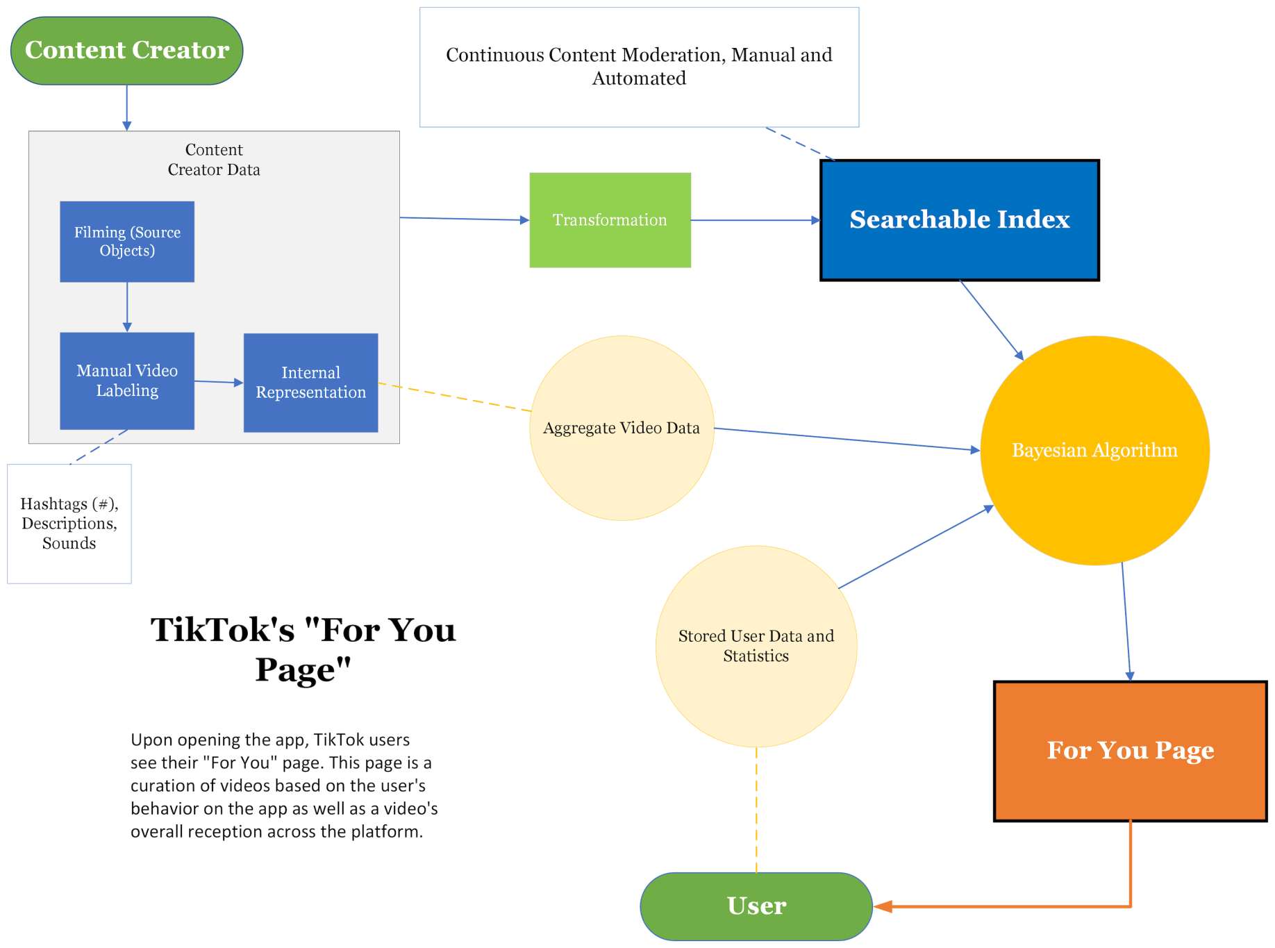

Since the user does not search for content on the FYP (they can only scroll through it), this first diagram illustrates the flow of information from the content creator to the user. (Note creators are also TikTok users, but the distinction is made to limit confusion.) First, the creator films a video, and TikTok is unique in this because in the process of doing so, the platform itself gives creators many editing and special effects tools to work with if so chosen. Videos can be uploaded to TikTok or directly filmed with the app so long as videos are between 15-60 seconds. So, the creator films, and the tools and filters they choose automatically becomes descriptive metadata within TikTok's system.
Next is the option for creators to add hashtags and/or descriptions to their videos. This is more important in the next diagram when dealing with searches, but nevertheless is factored into the algorithm as a way of helping indicate video subject matter. All of this information then is formally retained in one unique creator profile so it can be referenced to by the system (internal representation). Note from here hashed line to the large circle represents this content from creators in aggregate.
Going on to transformation, the video's data is syntactically transformed so that the system can recognize it within the searchable index. This is essential when a query is made (again more important for the next diagram), and it follows that before reaching someone's FYP videos must be stored within the searchable index (or something of the sort) for the algorithm to pick it up.
The Mysterious Algorithm
Because of TikTok's popularity, there has been no shortage in interest towards understanding its algorithm, in large part because people want their videos to get more views. The algorithm has no resemblance to a boolean search and is fundamentally more bayesian, being a recommender system that uses personal data to predict what content may be likely for a user to enjoy.
First, the system learns more and more about its users as they watch and interact with more videos. User's interactions with the videos are score-based using at least the following metrics: rewatch rate, completion rate, time watched, follows, shares, comments, and likes. These are all weighted.
That is half the story. On the other side of the system, videos go through a life cycle which seems less clear. First, a video made by any given person will be sent out a small number of people's feed - the extent to which this is random or not is unclear. Next, if the video does well enough, based on the prior-said metrics from the user, it will be shown to more people, and so on, or otherwise will no longer be shown on the feed.
But what makes TikTok unique is that process of choosing which users to show videos is not entirely like a matching algorithm, because while it does output videos with the highest probability of relevance based on user data, TikTok also intentionally introduces users to more diverse content. How TikTok does this is only really known inside the company. But assuming TikTok shows people videos they think are possible (not necessarily probably) to interest users, this in a way adds another layer of bayesian sophistication to the algorithm.
Theoretically then, the system actually contains two recommender systems: one predominate, which shows the system's best prediction of content you'll like on your feed, and another, which shows the system's best prediction of what content is the most meaningful to you outside of your app history so far. It is worth noting here TikTok has incredibly advanced natural language processing techniques and ability to recognize video environments - which likely lets TikTok 'semantically' encode videos in a way that gives them deeper meanings than simple genre categorization.

The green and orange boxes symbolize syntactic and semantic processes, respectively, under the assumption machine learning has gained the ability to better "semantically" understand things
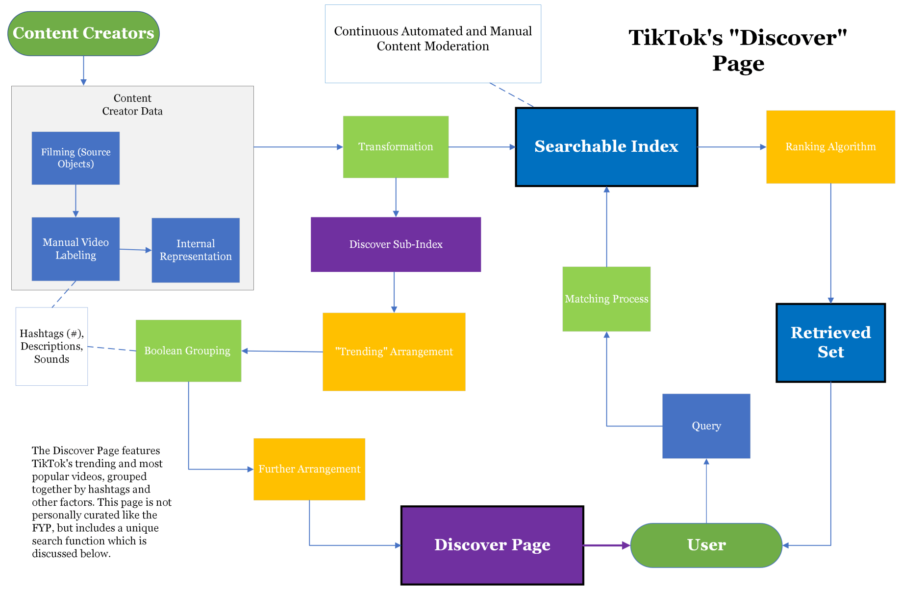
The Discover page includes groupings of videos to select and explore, as well as a search bar at the top of the screen. As the name suggests, the Discover page is meant for users to explore, and the predominate feature is categorizations of videos by their hashtags. The search bar goes with this motif of exploration but is actually searching the entire platform.
Let's start with the user query. Unlike the FYP algorithm, a simple search on TikTok does not use an especially unique algorithmic process. When a user begins typing in their search, a dropdown menu of completion suggestions will keep adapting, which the user can ignore or can choose from (not based on user data). If the user selects someone's profile from that menu, they are taken directly there; if not, they are shown an arrangement of videos based on popularity and other factors that are also not based on user data profiles.
Now for the context of the diagram from the user query. "Matching Process" was the terminology chosen instead of formal query because it (theoretically) directly matches with a subset of content from searchable index regardless of the user's data profile. Then after this, the set is ranked (or arranged) based on popularity metrics that again are not connected to user data profiles. In some ways the matching process has boolean characteristics - for example, using a hashtag guarantees the retrieved set to have videos with that hashtag - but still the results will always be ranked. The search is more bayesian as a whole because the retrieved set is still based on popularity metrics from the platform - even if its process doesn't incorporate user data like the FYP algorithm.
Information flow from the content creator to the Discover page, and thus the user, is the result of a continual process of transformations and arrangements. Because information flow is automated, the diagram takes a slightly different approach to semantic and syntactic labor. It is color-coded such that green boxes represent syntactic processes and orange boxes represent semantic expansions - the concept being that an automated machine needs a formal baseline of understanding before it can try to predict the human semantic meaning.
For example, the data record of one video will get increasingly large in size as a result of the video's increasing exposure on the platform, whereby machine learning algorithms constantly assess and re-assess the record's semantic meaning and relevance based on how it has been interacted with. The record then is distributed accordingly (orange box). However, for the process to happen in the first place, the record needs to be "formalized," or syntactically encoded, to ensure the video won't get lost in the system (green box).
The "Boolean Grouping" box is interesting because on the one hand, videos are matched to corresponding groups on the Discover page literally by syntax (by hashtags). In context with the rest of the system and diagram's information flow, color coding it as syntactic process makes sense. The subsequent "Further Arrangement" could apply to multiple things happening after the videos are grouped together: the clearest example being the literal arrangement of the groups themselves based on popularity metrics.
In short, though the Discover Page lacks the sheer genius of the FYP algorithm, it still uses a sophisticated organization scheme that successfully engages users.
Create your own site - Details here